Redesigning consumer NHS app for better user experience.
TIMELINE
June-July 2024
TOOLS
Figma
MY ROLE
UI/UX Designer
Research
Introduction
The NHS app is a critical digital service, connecting millions of users with essential healthcare resources, from booking appointments to accessing health records.
In this project, I redesigned the user experience and overhauled the UI for the NHS Login/Sign-up process. This effort aimed to enhance streamline navigation, and improve security, making it one of the most significant updates to the NHS app.
Problems
The NHS app's login feature was last updated in November 2022.

Fragmented Login Flow
The login process is divided into two screens (email and password), which disrupts user flow and increases effort.
Impact
This fragmentation leads to a higher likelihood of frustration, potentially causing increased drop-off rates during login.

No Dedicated Sign-up Page
The current app lacks a dedicated sign-up page, limiting users’ ability to create an account directly from the app.
Impact
This omission increases the barrier for new users, potentially discouraging sign-ups and leading to lower user acquisition.

Single Authentication Method
The current login process relies solely on a security code sent to the registered mobile number, offering no alternative options.
Impact
This limitation increases the chances of login failures and leading to user frustration.
Goals
Faster, Seamless Login Experience
Provide a more efficient login process by minimizing steps and offering a "Remember this device" option for returning users, creating a smoother experience for frequent access.
Enable a Quick and Intuitive Sign-up
Flow
Incorporate a straightforward in-app sign-up process to reduce the effort required for new users to register and increase overall user satisfaction.
Multiple Login Options for
Enhanced
Accessibility
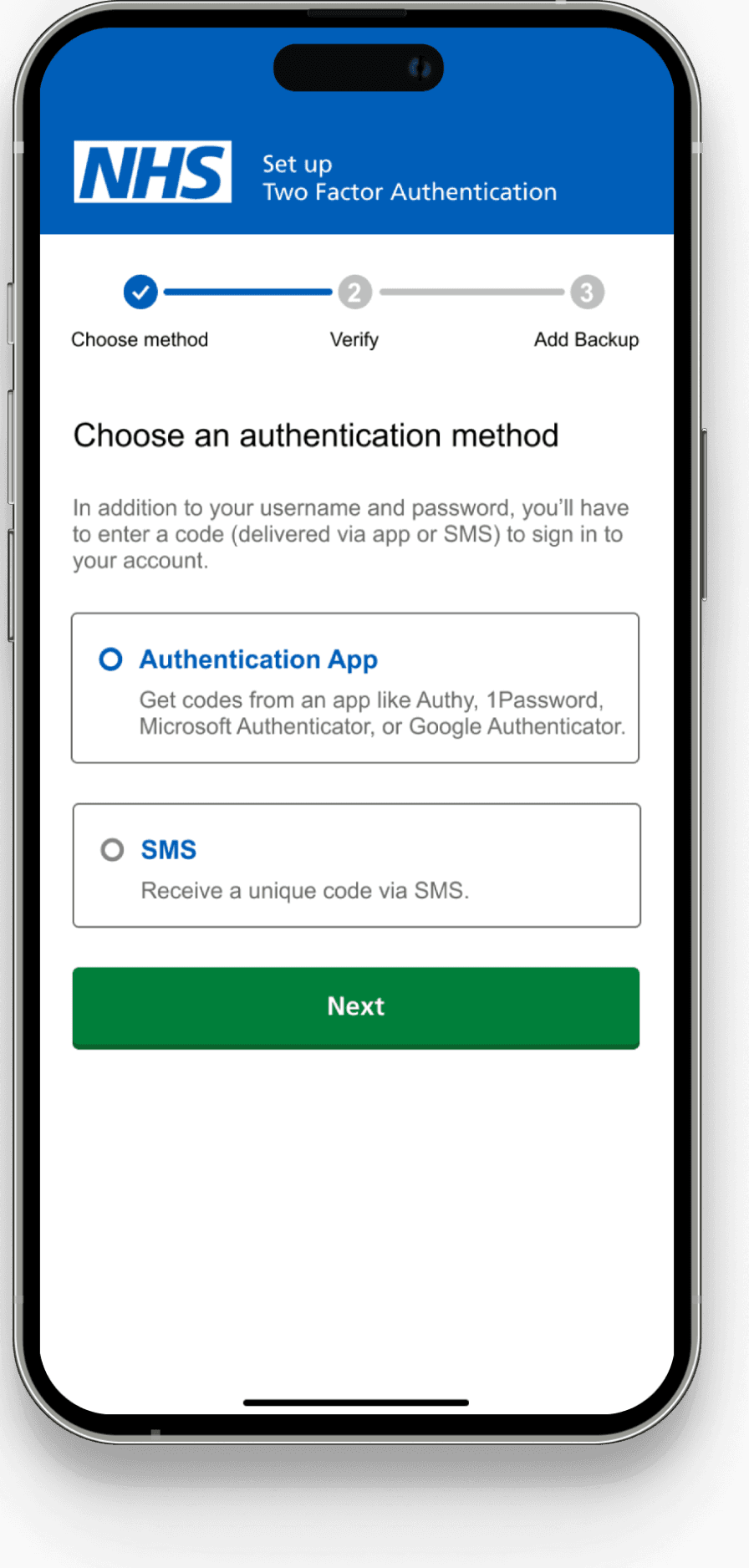
Introduce multiple authentication methods. In addition to SMS codes, users will be able to use an authentication app like Google Authenticator or Microsoft Authenticator, offering an alternative method for verification.
Final Design
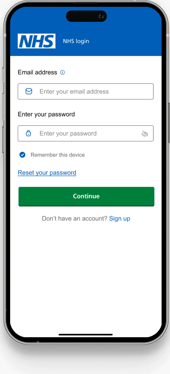
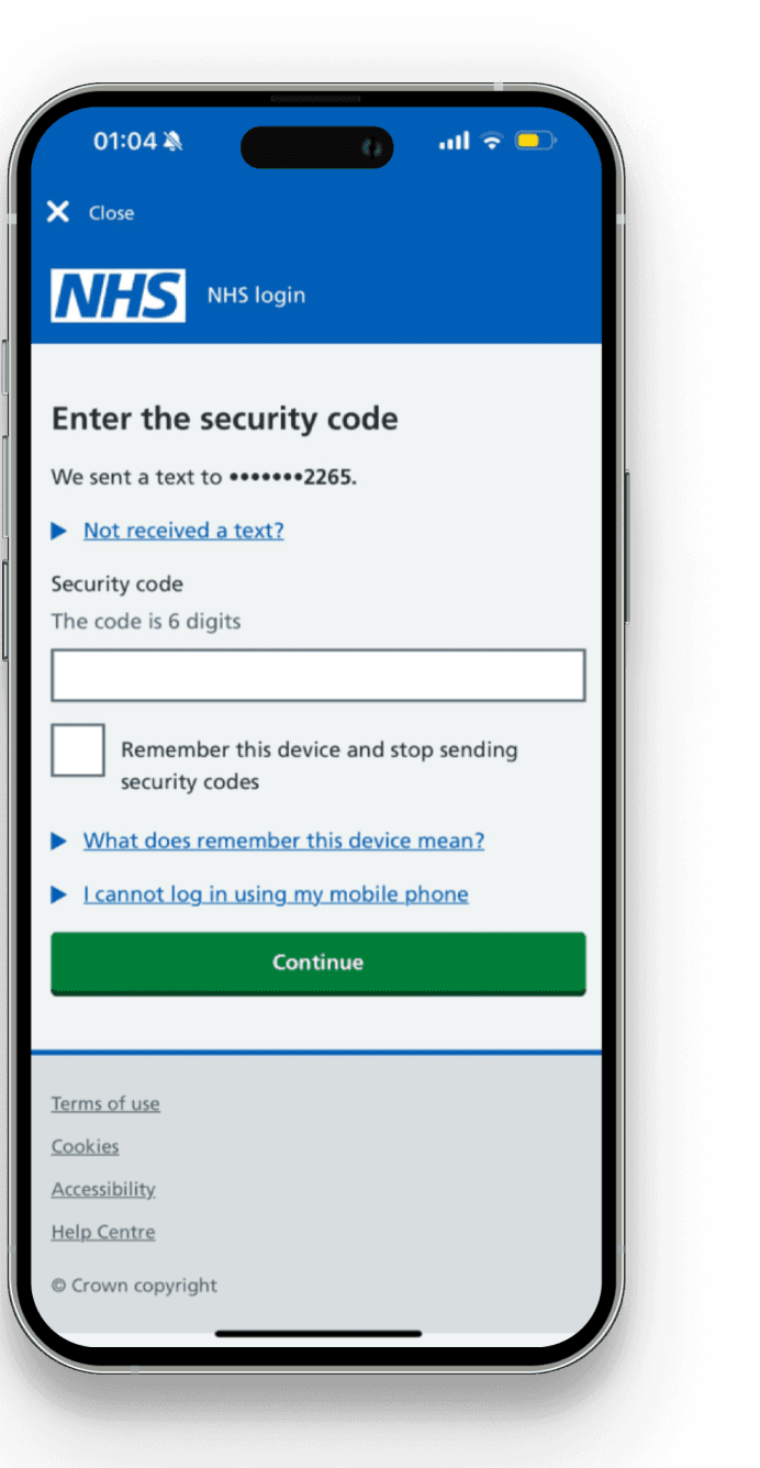
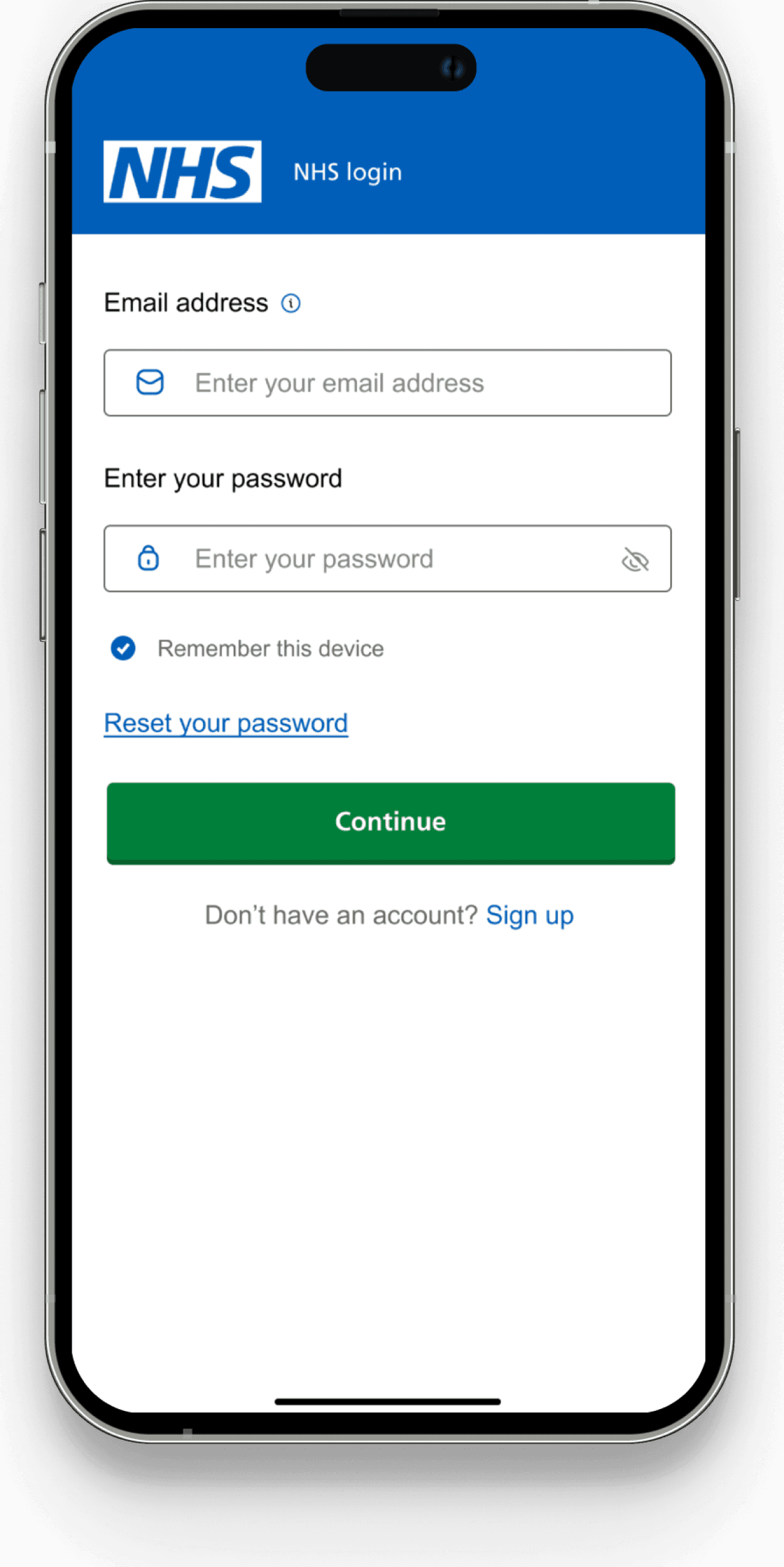
Streamlined Login Experience
Provide a more efficient login process by minimizing steps and offering a "Remember this device" option for returning users, creating a smoother experience for frequent access.
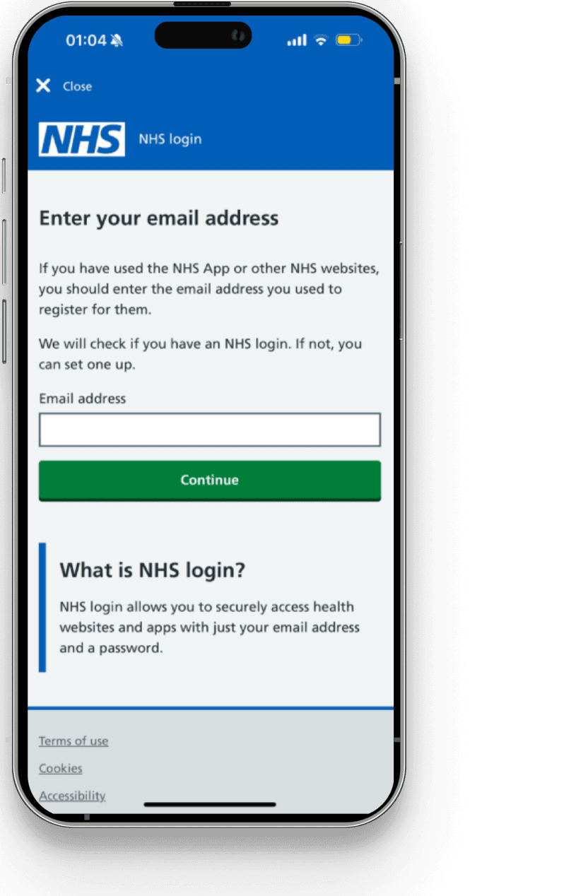
Separate screens for email and password
No sign-up option
Both email and password fields are combined into a single screen
A clear "Sign up" link is included on the same page
Improved User Onboarding with Integrated Sign-up Flow
The new design introduces a dedicated sign-up page, allowing new users to create accounts directly in the app—something that was missing in the old design.
The old design does not provide any in-app sign-up option
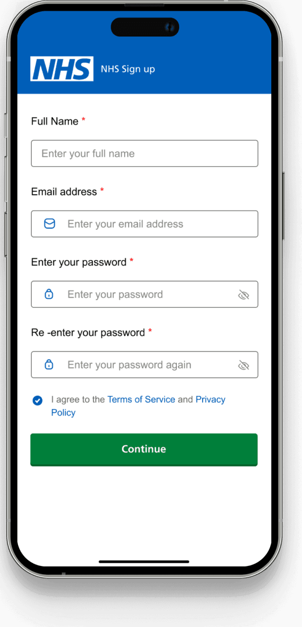
Integrated Sign-up Page
Clear Call-to-Action
Streamlined Onboarding with all necessary fields
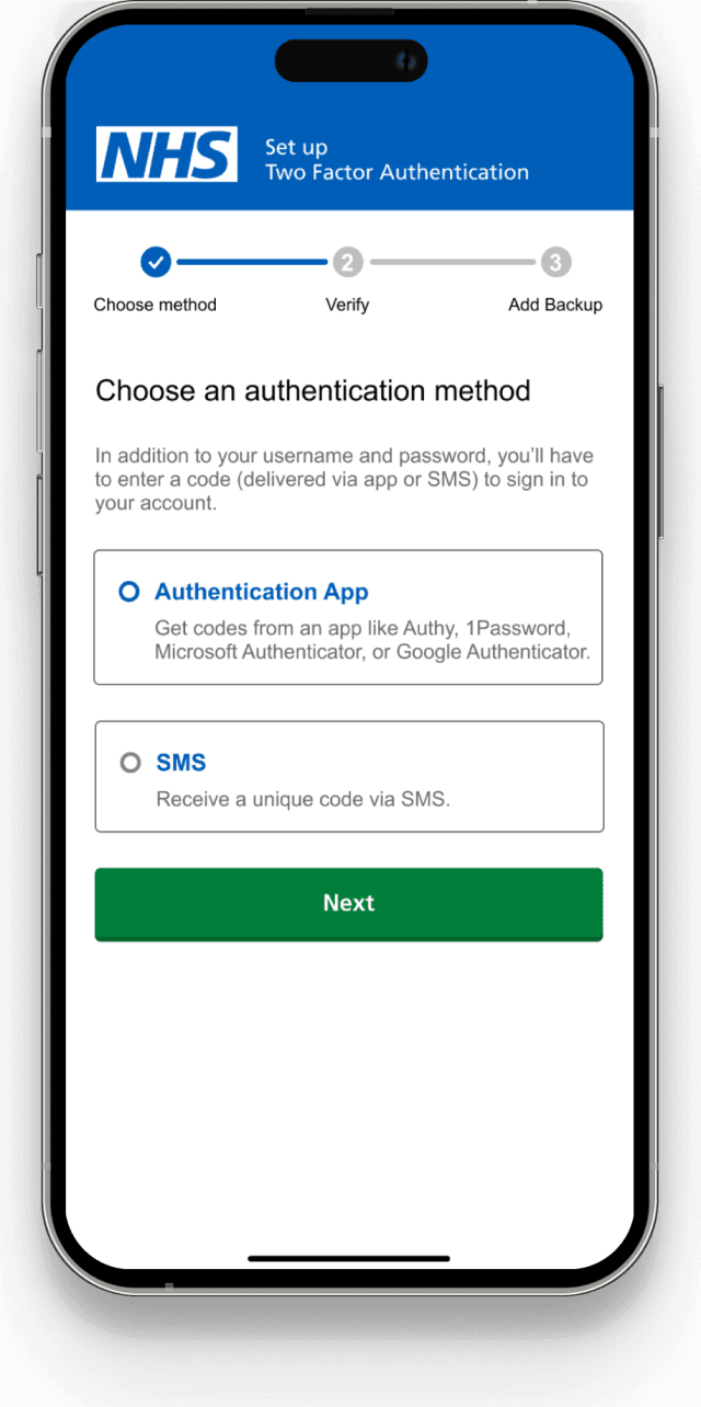
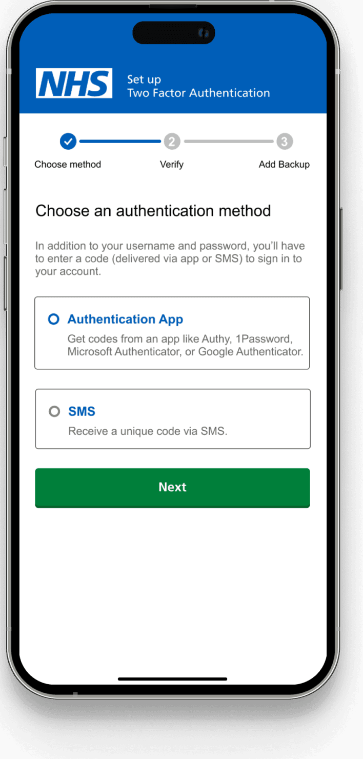
Multiple Login Options for Enhanced Accessibility
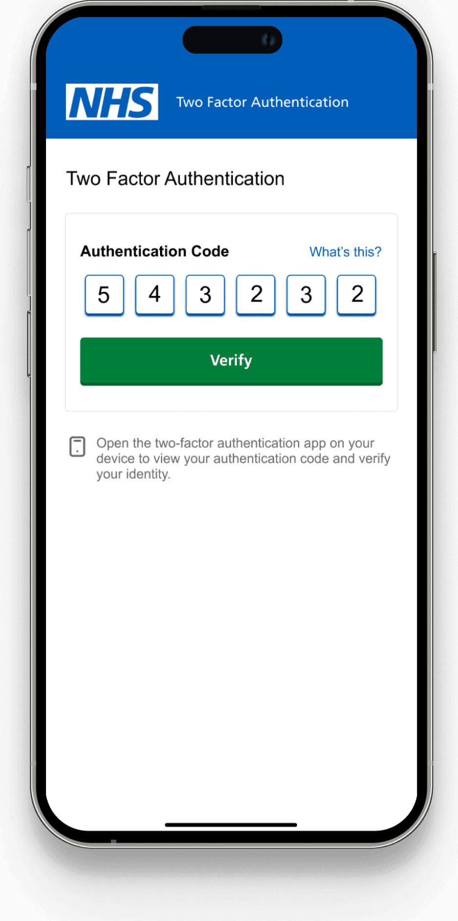
The new design introduces multiple authentication methods with Two-Factor Authentication (2FA), offering both SMS and authentication app options. This greatly enhances security and flexibility for users.
Users can only receive a security code via SMS
No alternative options for verification
Users can now choose between SMS and an authentication app
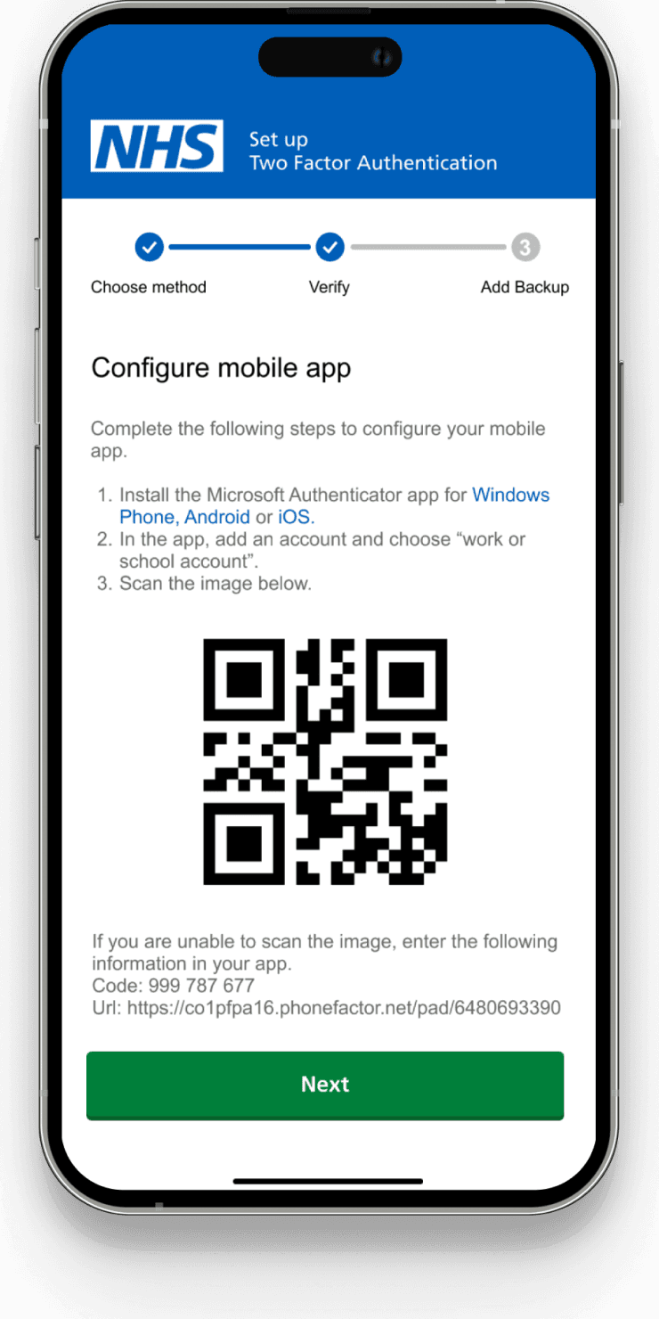
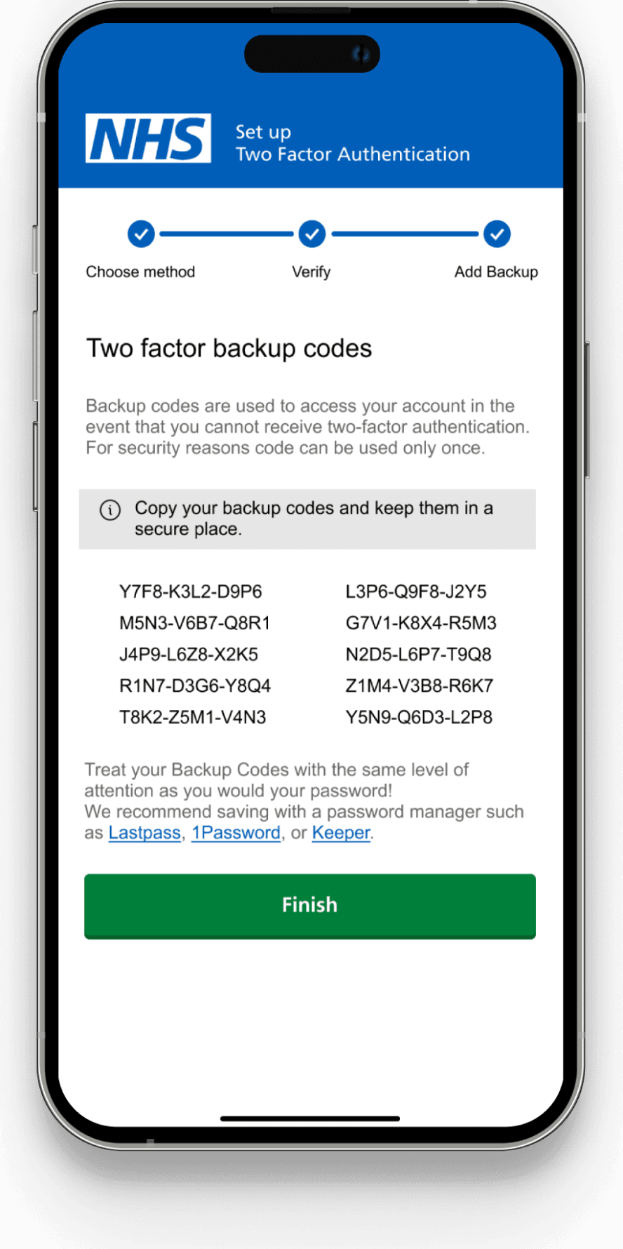
A step-by-step guide helps users easily set up Two-Factor Authentication
Clear and guided setup Two-Factor Authentication
Guiding users from selecting their authentication method to verification. The use of QR codes for app configuration and flexible options (SMS or app) makes the setup secure.


Please reach out to if you want to know about the research process.
Thank you for reading through! Hope you enjoyed learning about my design and thought process. :)


Redesigning consumer NHS app for better user experience.
TIMELINE
June-July 2024
TOOLS
Figma
MY ROLE
UI/UX Designer
Research
Introduction
The NHS app is a critical digital service, connecting millions of users with essential healthcare resources, from booking appointments to accessing health records.
In this project, I redesigned the user experience and overhauled the UI for the NHS Login/Sign-up process. This effort aimed to enhance streamline navigation, and improve security, making it one of the most significant updates to the NHS app.
Problem
The NHS app's login feature was last updated in November 2022.
Fragmented Login Flow
The login process is divided into two screens (email and password), which disrupts user flow and increases effort.
Impact
This fragmentation leads to a higher likelihood of frustration, potentially causing increased drop-off rates during login.
No Dedicated Sign-up Page
The current app lacks a dedicated sign-up page, limiting users’ ability to create an account directly from the app.
Impact
This omission increases the barrier for new users, potentially discouraging sign-ups and leading to lower user acquisition.
Single Authentication Method
The current login process relies solely on a security code sent to the registered mobile number, offering no alternative options.
Impact
This limitation increases the chances of login failures and leading to user frustration.
Goal
Faster, Seamless Login Experience
Provide a more efficient login process by minimizing steps and offering a "Remember this device" option for returning users, creating a smoother experience for frequent access.
Enable a Quick and Intuitive Sign-up Flow
Incorporate a straightforward in-app sign-up process to reduce the effort required for new users to register and increase overall user satisfaction.
Multiple Login Options for Enhanced Accessibility
Introduce multiple authentication methods. In addition to SMS codes, users will be able to use an authentication app like Google Authenticator or Microsoft Authenticator, offering an alternative method for verification.
Final Design
Streamlined Login Experience
Provide a more efficient login process by minimizing steps and offering a "Remember this device" option for returning users, creating a smoother experience for frequent access.

Separate screens for email and password
No sign-up option
Both email and password fields are combined into a single screen
A clear "Sign up" link is included on the same page
Improved User Onboarding with Integrated Sign-up Flow
The new design introduces a dedicated sign-up page, allowing new users to create accounts directly in the app—something that was missing in the old design.

The old design does not provide any in-app sign-up option
Integrated Sign-up Page
Clear Call-to-Action
Streamlined Onboarding with all necessary fields

Multiple Login Options for Enhanced Accessibility
The new design introduces multiple authentication methods with Two-Factor Authentication (2FA), offering both SMS and authentication app options. This greatly enhances security and flexibility for users.
Users can only receive a security code via SMS
No alternative options for verification
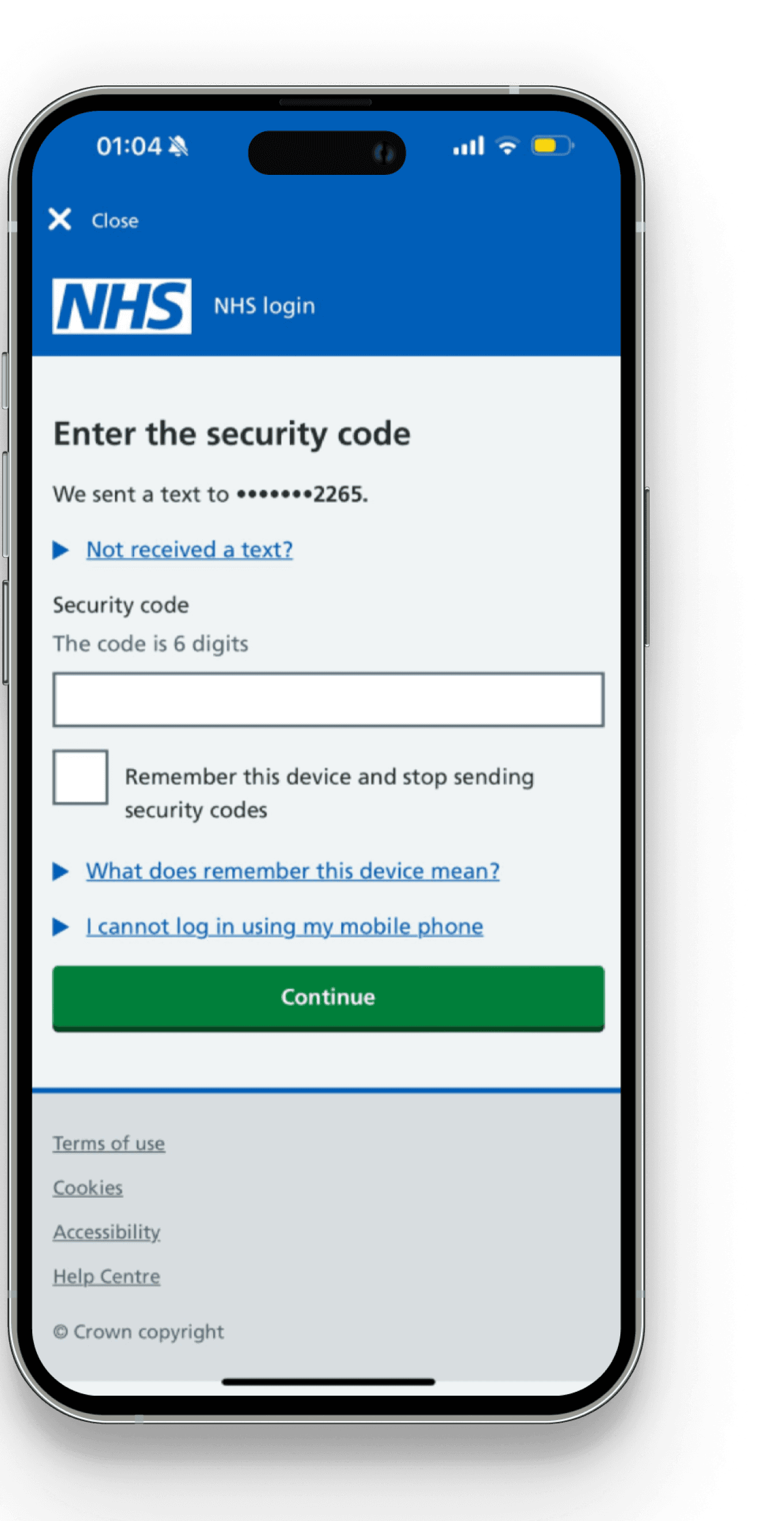
Users can now choose between SMS and an authentication app
A step-by-step guide helps users easily set up Two-Factor Authentication

Clear and guided setup Two-Factor Authentication
Guiding users from selecting their authentication method to verification. The use of QR codes for app configuration and flexible options (SMS or app) makes the setup secure.


Please reach out to if you want to know about the research process.
Thank you for reading through! Hope you enjoyed learning about my design and thought process. :)